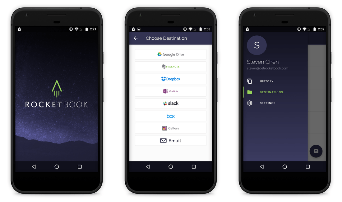
We're excited to announce that the redesigned Android app will be available very soon! After the successful launch on iOS, we're ready to bring the fun over to Android 🚀
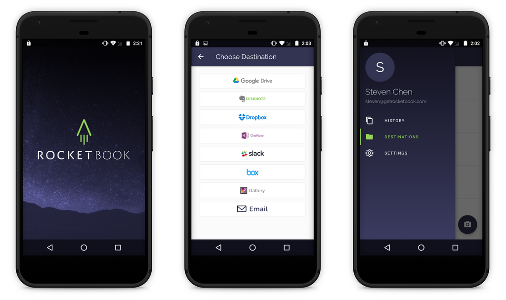
As noted in our iOS blog post, our focus during this redesign was to make the app more delightful and intuitive while maintaining the existing feature set. So, while you’ll experience a big change in the look and feel of the app, the functionality will largely stay the same. Here’s a sneak peek of what to expect!
A MORE INFORMATIVE DESTINATIONS SCREEN
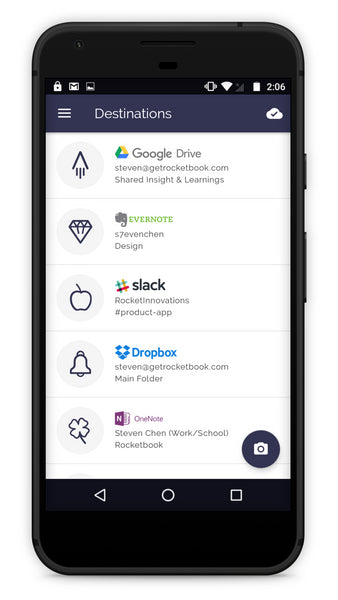
The updated Destinations screen allows you to see the cloud service, user account, and folder that your icon is connected to.
AN EASIER WAY TO RENAME SCANNED FILES
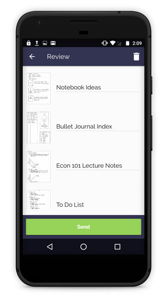
You can now easily rename scanned files before sending them to their designated locations.
SCANNED FILES SORTED BY SCAN DATE ON THE HISTORY SCREEN
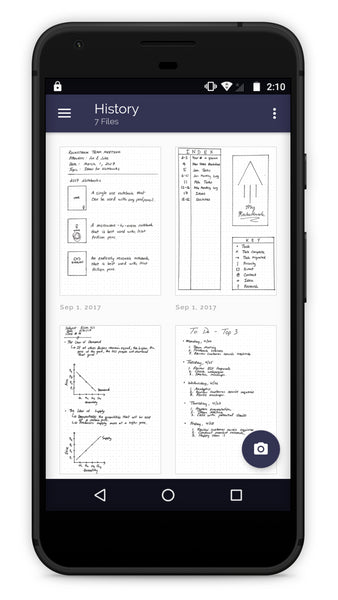
Scanned files are now organized by scan date, so that you can more quickly find the last file you scanned.
Our goal remains to provide you the easiest way to get your handwritten notes organized and safe in the cloud. We began the redesign process back in March 2017 and appreciate all the feedback you have given us via in-person meetings, video chats, phone calls, and emails.
If you happen to notice any bugs or have any feedback on the app, please let us know at feedback@getrocketbook.com. We look forward to continue working with you to evolve this app!
